WEB POJECTS
Support Page
For Makemytrip.com
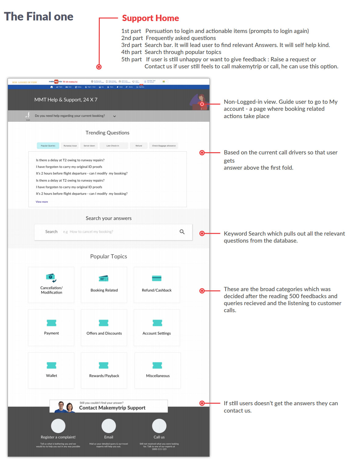
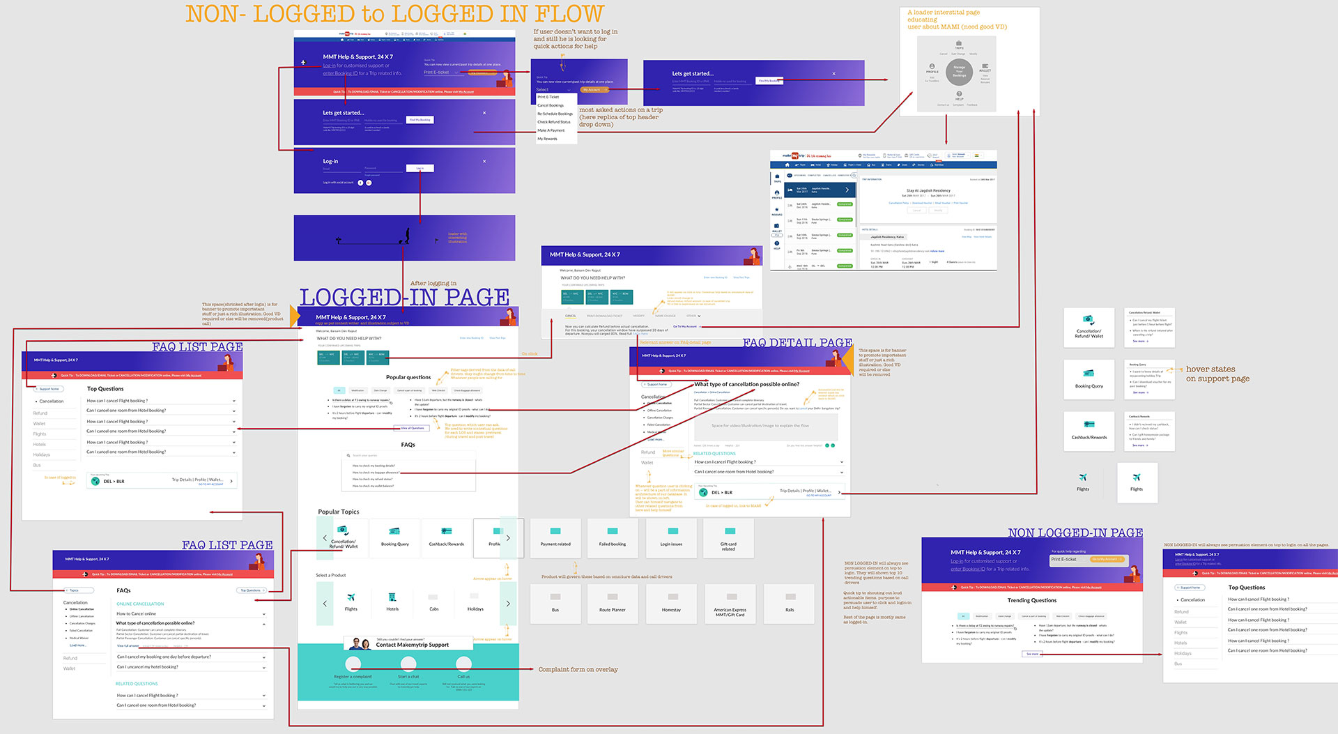
The idea of Support page to assist customers 24x7 regarding all the services available on MMT. Before 2016, MMT had FAQ page which was 6 year old. Support was mainly dependent on mail & call. Support page should cater all the queries of users. It should be self-serve and helps users to help themselves to find the soluLon.
What data says:
4.5 lakhs of calls/mails in a month. JAN-FEB’ 17 data:
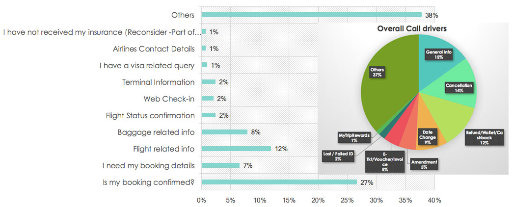
60% of users who visit My Account page don’t call.
90% of users who call doesn’t visit my account page.
Goal of the project
The main goal of the ‘Support page’ was to reduce the number of calls in customer care cell.
User Stories
(3 Scenerios during Pre travel, during and post travel)
Brief Research
- Visited call centre and done contexual enquiry with call center execu5ves.
- Detail study of tool called Einstein which has some ready made answers for agents.
- Go through support mails and categorise them under labels like refund, general enquiry etc.
- Done card sorting exercise for deciding priorty of label and understand user’s mind set of grouping.
Challenge
- Convince the director (postsales) to make a proper support page rather than skinning of old FAQ page
- Buy 5me from product manager to do research
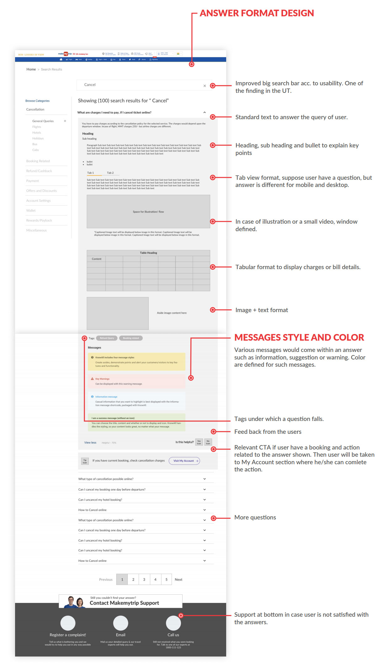
- Talk with developers to add func5onality of keyword search
- Sit with frontend developers for the proper execu5on of micro interactions
- Explain the logged-in and non-logged in user to homepage team
- Keep the PMs of other LOBs in loop as postsales is horizontal.
For example gathering top ques5ons and trending ques5ons from them
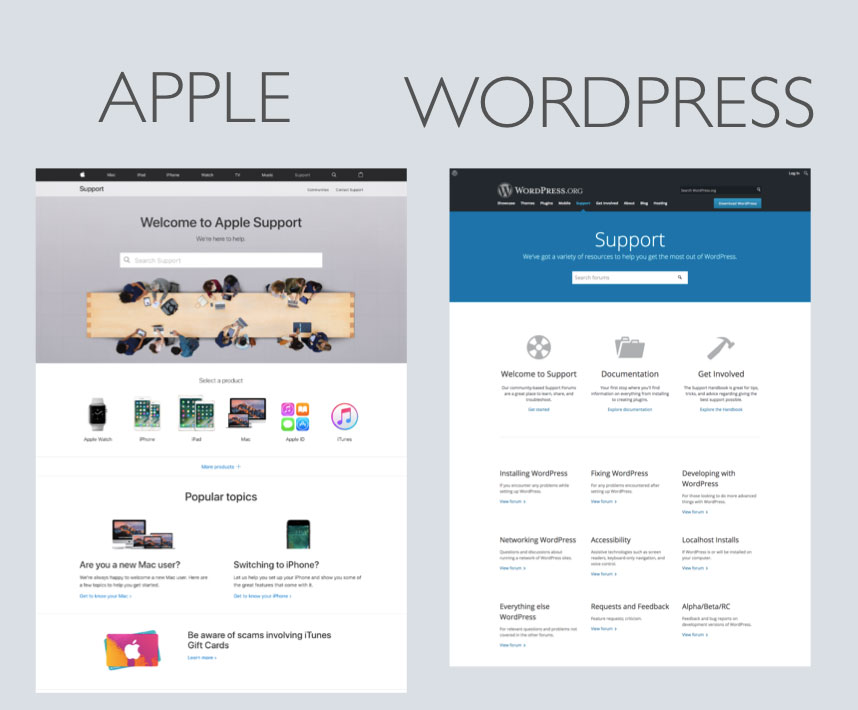
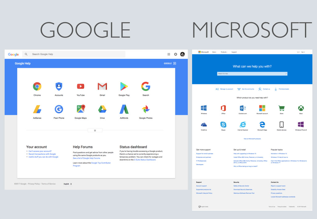
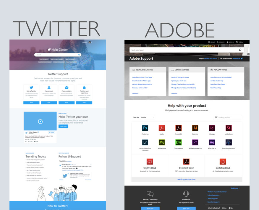
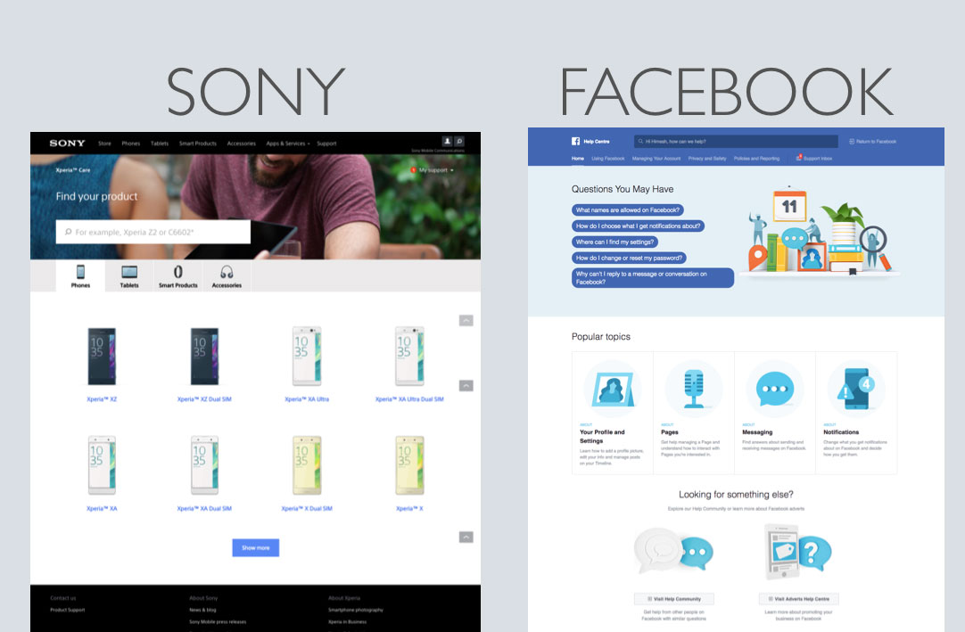
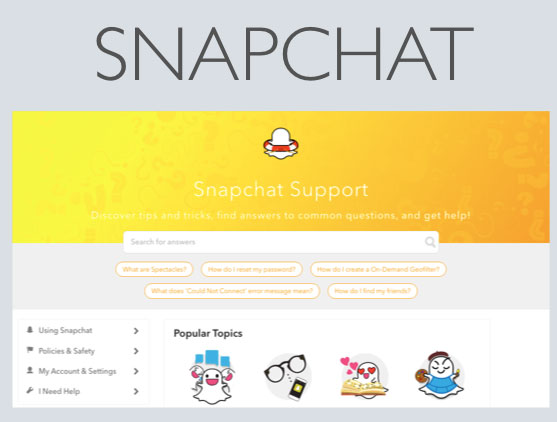
Competitor Analysis
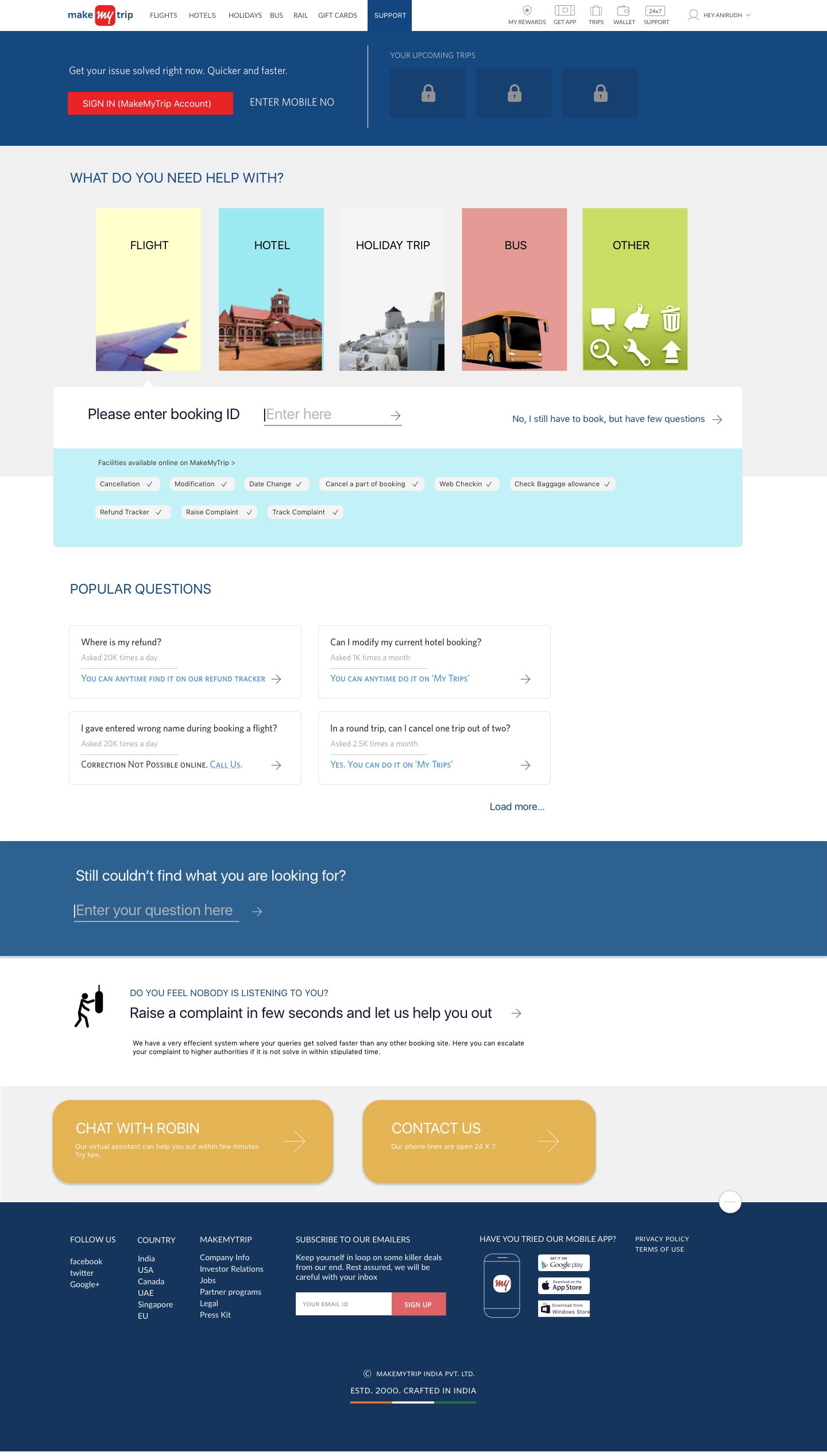
View good competitor sites and analysis IA and structure of them. They have few things common : Search bar, relevant/trending upfront ques5ons and popular topics.
Goal of the project
The main goal of the ‘Support page’ was to reduce the number of calls in customer care cell.
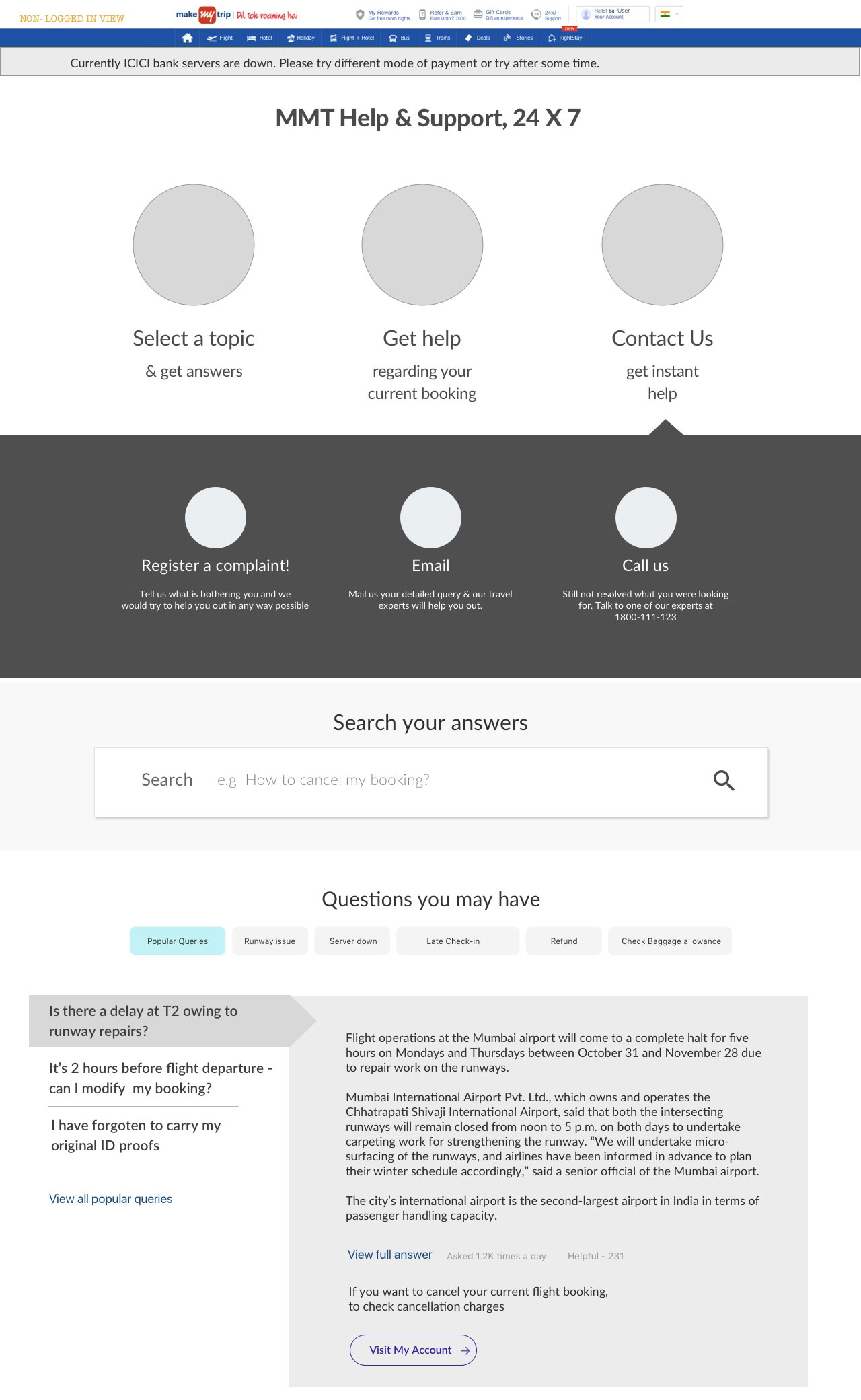
Process Followed
The Lean UX process was followed to complete the project. Various options were tested. Various layouts were made based to the insights, taks & taskflows generated after the research
Exploraton in IXDs started based on the self help model. Started with LOBs and asking for booking ID for further ac5ons. But this involved too many steps and users felt lazy. They were interested in quick help. Also there was space constraint in this option
New Approach to give users 3 options in start- select topic/ help regarding booking/ contact us. But this approach failed in user testing as people straight away opt to contact without going through other optoins.
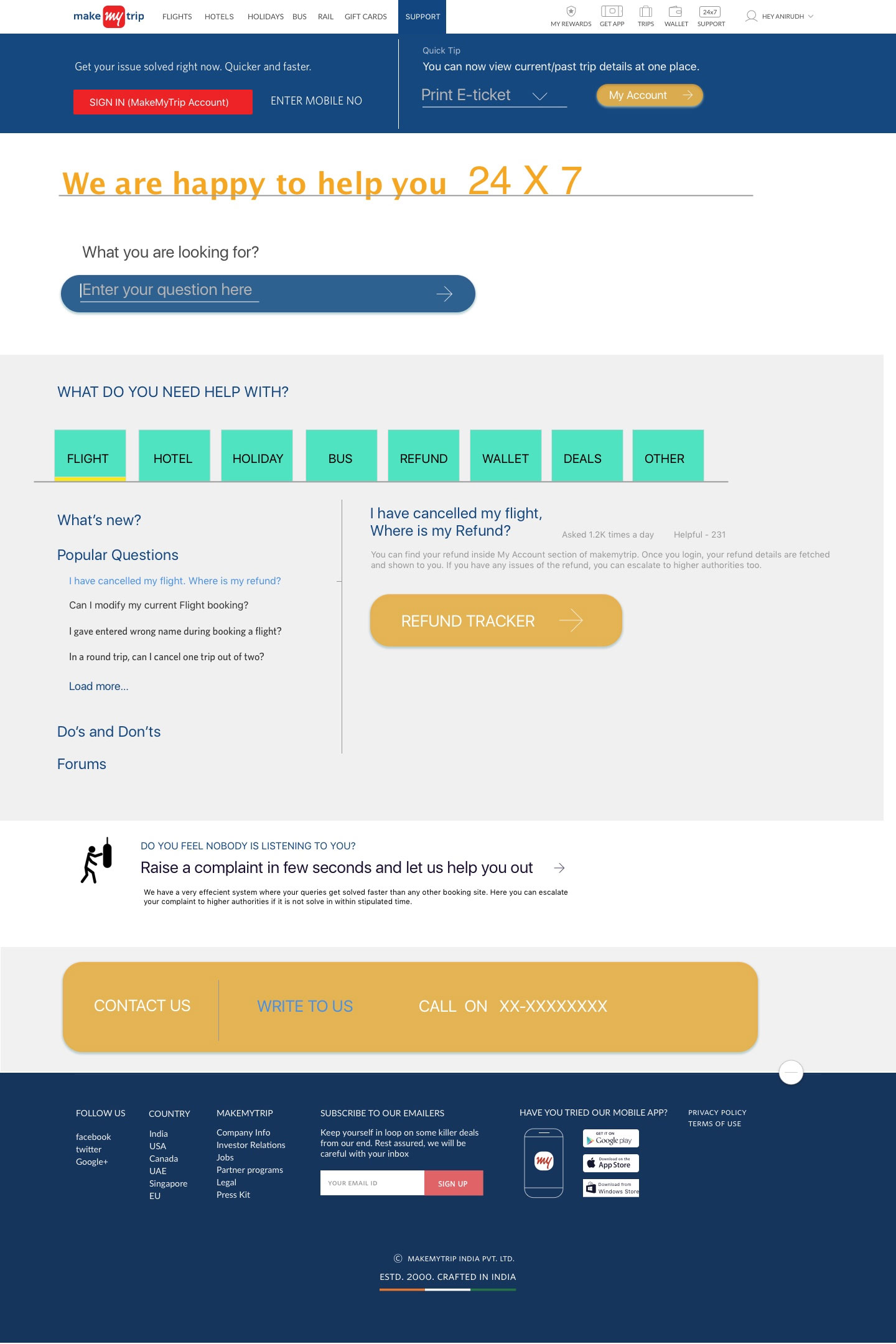
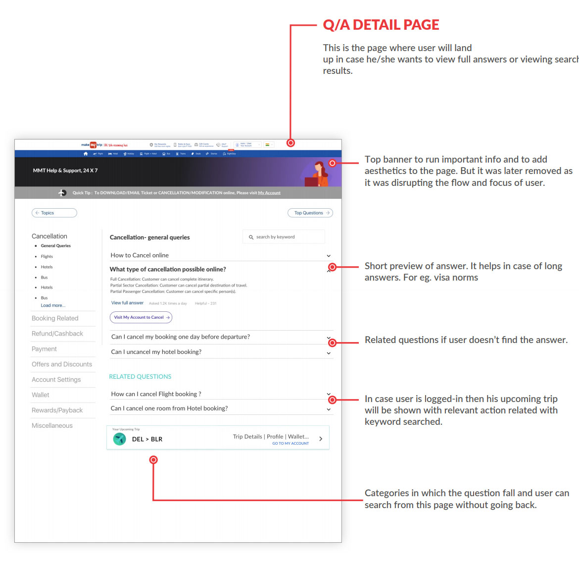
Tried to merge two pages together - support home & detailed answer page. But user felt cognitive load as too much of things were going on one page.

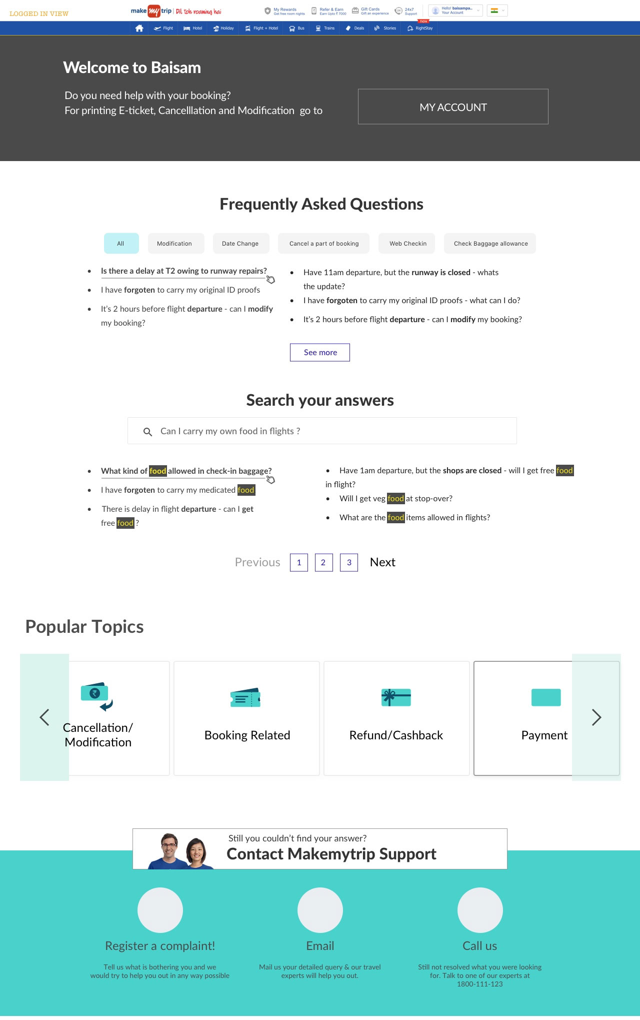
Innovative approach to auto detect the bookings of the users and show upfront the relevant actions related with the current bookings. But this approach would best work in case of logged-in user so it was decided to do this in phase 2. Current focus is on non-logged in users.
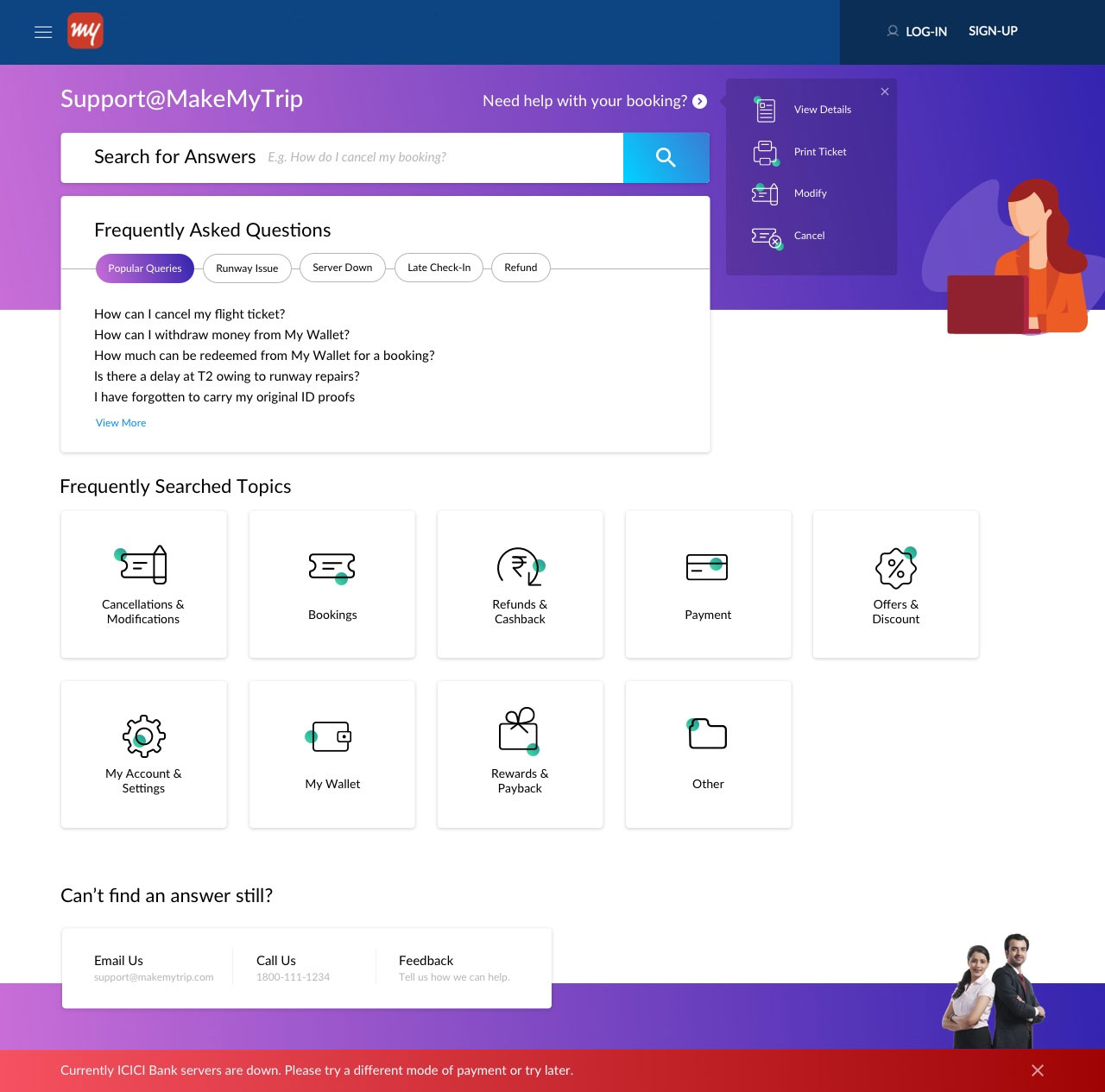
AXer user testing, this layout was finalized with some corrections. Search bar was coming below the first fold so it was decided to bring it on top. Other change was to remove crousel from the topics as users completely missed some topics.
Design system handling use cases
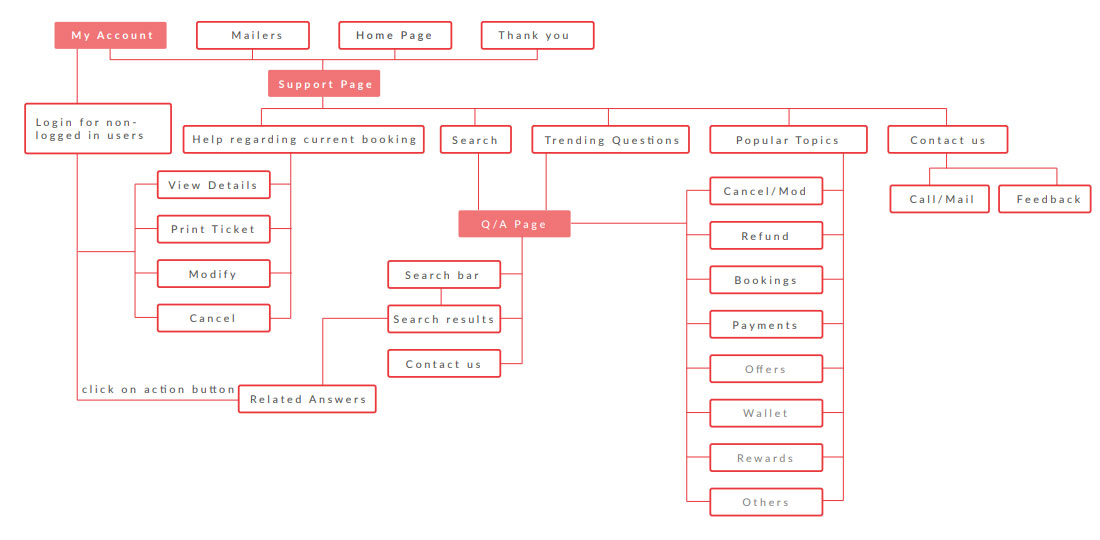
IA of final design
Final Visual Design